
HR Strategy
The Productivity Paradox: Why Your Workforce Productivity Software Is Hiding Real Performance Gaps
Why your current workforce productivity software might be masking critical performance gaps and learn how to gain true visibility into team output...

Chandan Watts
Technical Product Manager, Human Maximizer (Razor Infotech) · 13 min read · · Updated
Active time is the most reassuring number on any dashboard, and one of the least honest. A developer can sit at near-total "active" time for a whole sprint and still ship the feature three days late. The software swears they were working. The missed deadline says something the software never asked about. That contradiction is the heart of what we at Human Maximizer call the productivity paradox, and most workforce productivity software is built to hide it rather than surface it. It counts presence beautifully and progress not at all, which means the gap between "looks busy" and "moved the work" stays invisible right up until a delivery slips.
The uncomfortable part is that the tool is doing exactly what it was designed to do. It logs signals of activity. Keystroke counts, app focus, idle timers, screen locks. All of that is real data. None of it answers the only question a manager actually needs answered: is the work moving, and if not, where is it stuck?
The Productivity Paradox: When a Green Dashboard Hides a Red Project
High activity and low output can live comfortably in the same person, on the same day. That is usually structural, not a moral failing. The problem is rarely that people are lazy; the modern workplace is structurally designed to waste time — communication tools multiply, meeting invites stack, and the skilled work that moves organisations forward gets squeezed into the margins. Your best engineer glowing green may be green because they spent the day answering Slack pings for three colleagues, not despite it.

Here is how activity-first tools manufacture blind spots. They reward the visible. When a dashboard scores you on minutes logged, the rational employee front-loads easy, loggable tasks and quietly postpones the hard, quiet thinking that does not photograph well. Deep work looks like idleness on a timeline. So it gets deferred.
That is the first hidden performance gap: the tool can't tell the difference between someone stuck and someone thinking, or between someone productive and someone merely present. We wrote more about that failure mode in our breakdown of why most productivity tracking software fails and what to use instead. The short version: if a measure becomes the target, people optimise the measure, not the outcome.
Beyond Surveillance: Monitoring and the Psychological Contract
Ask staff whether monitoring software feels intrusive and the honest answer is: it depends entirely on what they think it's for. The same agent on the same laptop reads as helpful workflow visibility to one team and as a suspicion machine to another. The dividing line is the psychological contract, the unwritten deal about trust between an employee and their employer. Break it, and the numbers you collect start lying to you on purpose.
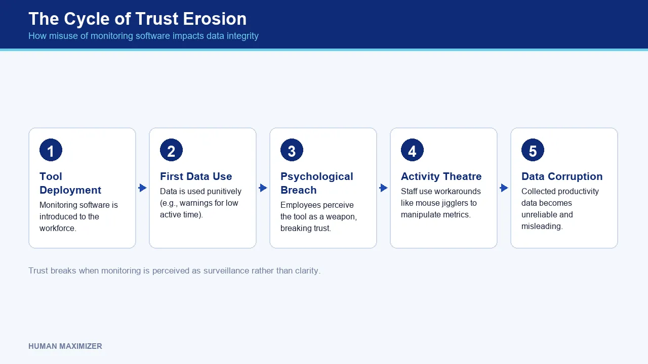
Employee pushback climbs the moment tracking feels like surveillance rather than clarity. And people are inventive. Mouse jigglers, decoy tabs, a text editor left open on a document nobody is reading. The tighter you squeeze on activity, the more activity theatre you get, and the less you can trust the very data you invested in.
Where trust actually breaks
The break rarely happens at rollout. It happens at the first use of the data. If the first time a team hears about the new dashboard is when someone gets a written warning for "low active time," you have taught the whole floor that the tool is a weapon. From then on, they manage the tool instead of doing the work.
This is why capability boundaries matter. Our own Productivity Lens deliberately never captures keystroke text, only counts, and screenshots or recordings are never triggered automatically by the agent. They happen only on an explicit, logged manager request. That design constraint is what keeps the psychological contract intact, because employees can see the line the software will not cross on its own.
If that balance sounds like what your floor needs, a no-obligation walkthrough shows how it holds up in practice. See it live.
The Indian Compliance Layer Most Tools Ignore
Global productivity platforms are built for a world where "hours worked" is a soft management metric. In India it is also a statutory one. This is the layer competitors' listicles skip entirely, and it is where activity data quietly becomes a legal liability.
Automated time and attendance tracking is not just an efficiency feature here. Working-hour ceilings and spread-over limits sit inside statute, not inside management discretion. The Factories Act, 1948 caps daily and weekly working hours and mandates overtime provisions, and the Code on Wages, 2019 consolidates the wage and overtime rules that a payroll run has to honour. If your productivity tool records that a field employee was "active" for eleven hours but your attendance and payroll systems never reconcile that against overtime entitlement, you have not built a productivity report. You have built evidence in a future dispute.
The fix is integration, not another standalone tracker. When Attendance Management and Payroll share one record, a geo-fenced check-in on the shop floor flows into the roster and the salary calculation as a single event rather than three spreadsheets someone reconciles by hand at month-end. A dedicated in-house compliance team keeps those statutory rules current on our side, so the calculation reflects the law as it stands, not as it stood two amendments ago.
That is the real answer to "which workforce tools suit Indian labour law": the ones where the productivity signal and the payroll obligation cannot drift apart.
Reading Data as Diagnosis, Not Verdict
Here is the ownable shift, and it is where nearly every workforce productivity software buyer goes wrong. A number on a dashboard is a symptom, never a diagnosis. The instinct is to read a low figure as a verdict on a person. The discipline is to read it as a question about a process. We call this the Diagnostic Read, and it is a habit any manager can adopt tomorrow, with or without our product.
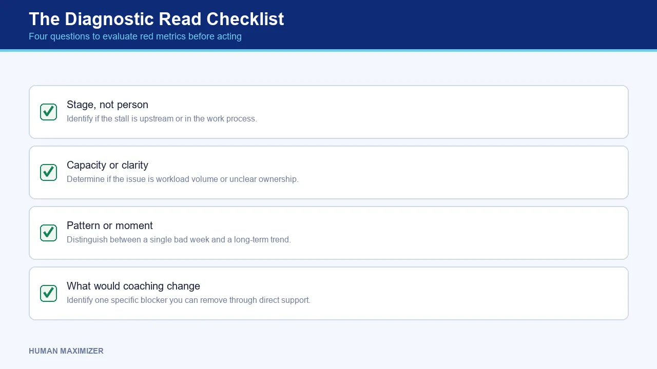
The Diagnostic Read checklist
Before you act on any red metric, run it through four questions. Copy these into your review template and use them every time:
- Stage, not person: Which stage of the work is stalling, and is the stall upstream of this employee? A "slow" designer is often waiting on a brief that never arrived.
- Capacity or clarity: Is this a workload problem (too much) or a clarity problem (unclear ownership)? These need opposite fixes. One needs redistribution, the other needs a definition of done.
- Pattern or moment: Is this a single bad week or a three-month trend? A moment needs a conversation, not a scorecard.
- What would coaching change: If you sat with this person for thirty minutes, what one blocker could you remove? If the answer is "nothing, they need to try harder," you probably have the wrong diagnosis.
Run those four questions and a red metric changes what a 1:1 sounds like. Before the Diagnostic Read, the meeting opens with "Your completion rate went red this sprint, what happened?", which lands as an accusation and earns a defensive answer. After it, the same manager opens with "Three of your tickets have been sitting in review since Tuesday; is the QA handoff where you're blocked?" One puts the person on trial. The other puts you both on the same side of the problem.
That conversation goes better when the goal itself was never in dispute. Human Maximizer's Synergy module keeps a manager's and a report's OKRs synced and visible to both sides, so the Diagnostic Read starts from a shared objective instead of a contested number.
Notice what the Diagnostic Read does. It converts productivity analytics and reporting dashboards from a scoreboard into a starting point for a conversation. Output becomes legible when the workflow has named stages, not when you log activity harder. A dashboard that tells you where work piles up between "assigned" and "in review" is coaching gold. A dashboard that tells you someone typed 4,000 keystrokes tells you nothing you can act on.
This is the entire design intent behind our Productivity Lens: it tracks task completion and milestone progression so a manager sees where work is stuck, not whether a person is at their desk. Pair that with task management that distributes workload against verified strengths rather than assumptions, and the coaching conversation writes itself. For appraisal cycles specifically, that same principle carries into how we think about fairer performance reviews for Indian teams.
Operational Efficiency: From Signal to Labour Cost
Cost optimisation is where the diagnostic approach pays for itself, and where surveillance-first tools cost you money you never see. Every hour of "active theatre" is a paid hour producing nothing. Every mis-diagnosed low performer you manage out is a rehire, plus the institutional knowledge that walks out the door with them.
Real efficiency comes from removing friction, not adding scrutiny. The workforce experience research is blunt about this: equipping teams with the right digital tools and using experience platforms to reduce digital friction is what actually lifts consistent output. A dashboard that surfaces a two-day approval bottleneck saves more money than one that shames a slow typist, because the bottleneck was costing every downstream person, every cycle.
Illustrative scenario, and to be upfront it is a composite assembled from patterns we see rather than one named account: a services team blamed its delivery delays on "low team engagement" and considered activity tracking to enforce it. The actual cause, visible once the work was mapped by stage, was a single QA handoff where tickets sat untouched for two days. No amount of activity monitoring would have found that. A view of where work stalled found it in one glance, and the fix was a reassignment, not a reprimand.
The Remote-First Toolkit for Distributed Teams
Distributed teams break activity-based tools worst of all, because presence is genuinely unobservable and genuinely irrelevant. For remote and field staff, the productivity dashboard features that matter are the ones that track outcomes across a reporting tree, not desk time.
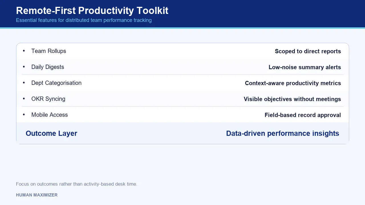
A remote-first setup needs team rollups scoped correctly to a manager's direct reports, so the reporting hierarchy is honoured server-side. It needs low-noise daily digests instead of a torrent of per-minute alerts. It also needs department-level categorisation, because the same app is productive for a support team and unproductive for assembly-line ops. A blanket "% productive" number that ignores that context is worse than no number at all.
For genuinely distributed goal-setting, keeping objectives visible without a daily status meeting matters more than any timer. Our Synergy module syncs OKRs between managers and reports so alignment survives distance, and the mobile app lets a field manager approve and check the same records from a phone. Data-driven decisions for remote teams come from that outcome layer, not from watching a green dot.
When Productivity Software Is the Wrong Tool
Honest limits, because pretending a tool is universal is how trust dies.
Activity and even outcome data cannot read genuinely unpredictable creative cycles. A researcher who spends two weeks reading before a breakthrough will look unproductive on every metric you have, and forcing them onto a completion-rate dashboard will only push them toward smaller, more loggable work. That is a real cost, not an edge case.
The data also cannot replace a conversation. A metric can tell you that someone is stuck. It can never tell you why, and treating a dashboard reading as sufficient grounds for a performance decision, without ever talking to the person, is the most common and most damaging mistake we see. It should never be the sole input to an appraisal. Where the same data becomes evidence in an overtime or wage dispute, the statutory record has to lead, not the productivity chart.
Frequently Asked Questions
How does workforce productivity software identify hidden performance gaps? It surfaces gaps only if it tracks where work stalls between stages rather than how active someone looks. Completion rates and milestone progression reveal a stuck handoff or an overloaded stage that activity timers hide completely. Activity data alone tends to conceal gaps by making busy people look productive.
Is employee monitoring software considered intrusive by staff? It depends almost entirely on scope and intent. Tools that capture keystroke text, silent screenshots, or webcam stills feel like surveillance and provoke pushback. Tools that count and categorise work signals, keep alerts low-noise, and require an explicit logged request before any screenshot feel like workflow clarity instead.
How can HR managers balance productivity tracking with employee morale? Use the data to coach, never to ambush. Introduce the tool openly, explain what it does and does not capture, and make its first visible use a workload conversation rather than a warning. When staff see it removing their blockers instead of building a case against them, the psychological contract holds.
Which workforce tools suit Indian labour law compliance? The ones where attendance and payroll share a single record, so working-hour and overtime obligations under the Factories Act and Code on Wages are honoured automatically. A standalone productivity tracker that never reconciles with payroll can produce hour data that contradicts your own statutory filings.
That developer coasting on a wall of green "active" time while the deadline slipped was never the problem the dashboard made them out to be. The problem was a tool built to watch the mouse instead of the work, and watching the work is exactly what we set out to build. Change what you measure and you change what you can fix: the stalled handoff becomes visible, the coaching conversation replaces the warning letter, and the person who looked idle turns out to have been thinking. Keep measuring activity, and the next missed deadline will still arrive as a surprise, three days too late to do anything about it.
About the Author & Reviewer
Chandan Watts — Technical Product Manager, Human Maximizer (Razor Infotech)
Chandan Watts is Technical Product Manager at Razor Infotech, building the Human Maximizer HR platform. After years leading customer-experience and team operations at JindalX and Radical Minds, he focuses on how teams actually work day to day — and how small workflow gaps quietly slow an entire team down.
Connect on LinkedIn
Reviewed & approved by Sameer Hameed — Founder & Chairman, Razor Infotech
Sameer Hameed is the Founder & Chairman of Razor Infotech, where he is guiding the creation of Human Maximizer. An entrepreneur across technology, real estate, mining and travel, he builds organisations on clarity, trust and responsible growth — on the belief that businesses grow only when the people behind them grow.
Connect on LinkedIn
Human Maximizer is built by Razor Infotech in New Delhi, India (founded 2019). About Human Maximizer.
Keep reading
HR Strategy
A Complete Guide to Measuring Productivity at Work
Are you struggling to measure productivity at work? Discover proven metrics, KPIs, frameworks, and tools HR leaders use to track employee and team performance.
5 min read
HR Strategy
Developer productivity software
How developer productivity software helps engineering teams minimize context switching and cognitive load to maximize deep work and output quality.
15 min read
HR Strategy
Employee productivity software
How to evaluate employee productivity software for your Indian business. Learn to balance performance tracking with team trust and data privacy needs.
13 min read